The labyrinth of the subconscious mind is the mysterious realm where decisions, habits, and emotions converge. Take a look at the secret mechanisms that shape our perceptions, often beyond the reach of conscious cognition. The compelling force in this cognitive theater is the interaction of color psychology brands. Colors, these silent architects of mood and reaction, hold the key to the complex dance of emotions.
Have you ever wondered why certain colors evoke calmness while others incite rage? The subconscious orchestration of warm colors that convey energy and cool tones that convey serenity remains fascinating. Dive into the realm of color marketing, a formidable tool wielded by retailers and consumer packaged goods (CPG) brands. Mastering this art transforms your brand and retail marketing into a dynamic force, leaving an indelible mark on your bottom line and improving the in-store customer experience.
- Color choices in branding evoke specific emotions and influence customer behavior.
- Selecting colors aligned with the target audience and brand identity is crucial.
- Consistency in color usage and readability are essential in effective branding.
What Is Color Psychology?
Color psychology for brands is a fascinating exploration of how colors influence human emotions and behavior. It delves into the complex interplay between different hues and tones, revealing the distinct associations they evoke, shaping moods and influencing decision-making processes. In marketing, the importance of color psychology for brands cannot be overstated. It directly affects how consumers perceive products and services and how they associate with them. Experienced companies recognize the importance of choosing a color palette that resonates with their target audience, meets their brand goals, and sets them apart from the competition. Numerous successful brands that use color psychology strategically leverage this research to create impactful visual identities, leaving a lasting imprint on the minds of their customers. Embracing the nuances of color psychology for brands is key to crafting a compelling and memorable brand presence.

The importance of color psychology in marketing and branding
Color psychology for brands is an integral aspect of marketing and branding that significantly impacts consumers’ first impressions and decision-making. The colors associated with a brand evoke certain feelings and perceptions, shaping how consumers relate to products. Entrepreneurs and brands that use color psychology strategically harness this phenomenon, recognizing that up to 90% of initial impressions are color-driven. The influence extends further: color increases brand awareness and recognition by an impressive 80%. In a competitive environment where visuals have a huge impact, a staggering 93% of consumers make purchasing decisions based on what they see. Color psychology marketing is the tool of choice for branding experts and design gurus, enabling them to create compelling advertising strategies that resonate with audiences deeply emotionally. Understanding and utilizing color psychology for brands is not just a trend but a crucial element in creating a long-lasting and influential brand identity.
Popular colors in branding
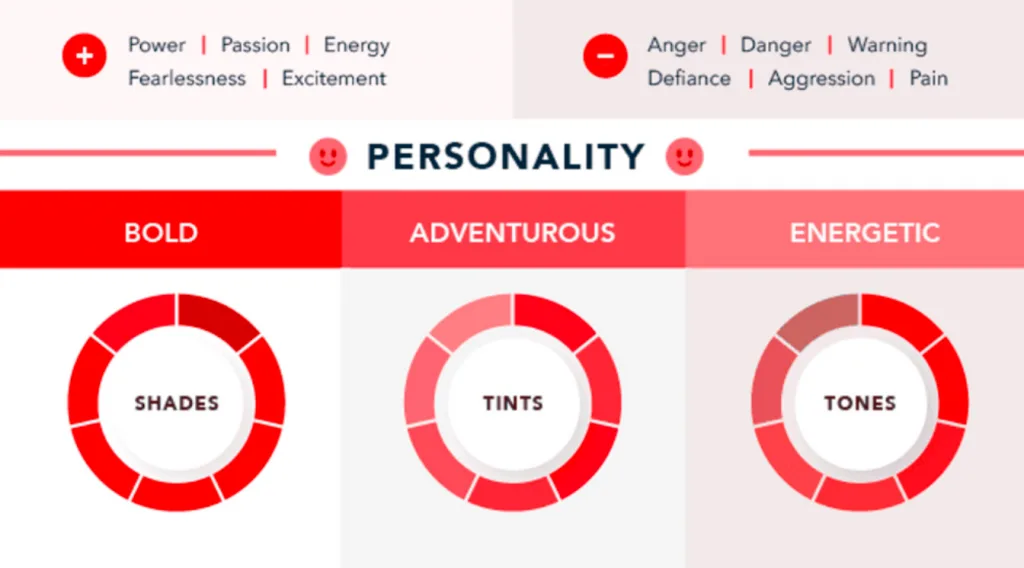
- Red: Red is a highly versatile hue that may elicit many emotions. It is frequently connected with ardor, excitement, and risk. Red may also be used to convey urgency or draw attention.
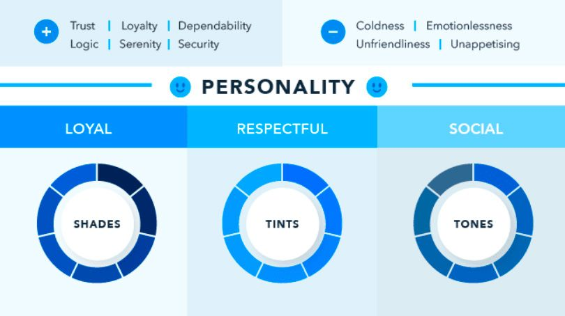
- Blue is a soothing hue connected with trust, security, and tranquility. It is a common choice for brands that wish to be viewed as trustworthy and reputable.
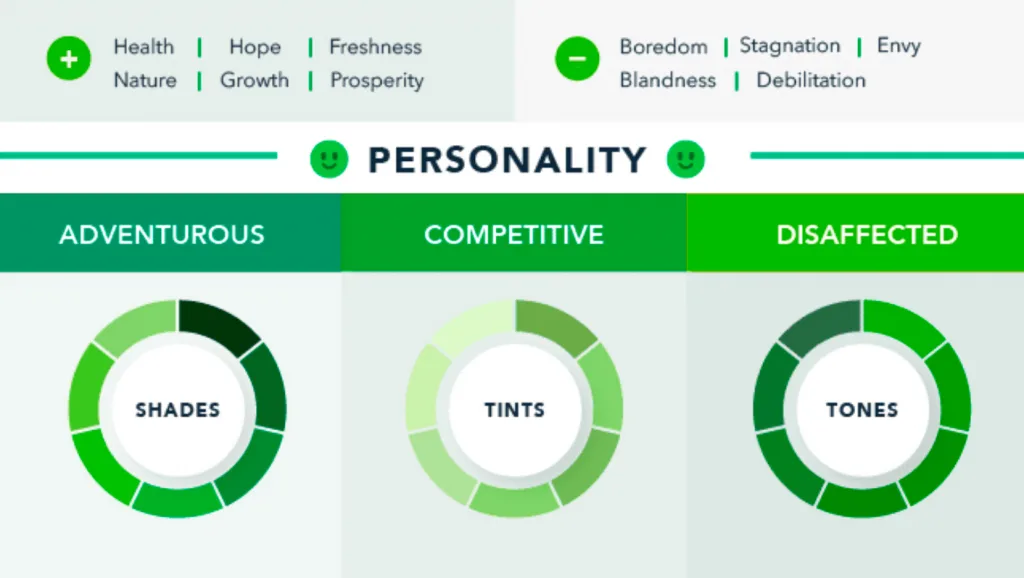
- Green is a revitalizing hue connected with nature, growth, and health. It is a popular option for businesses that wish to be considered environmentally friendly or healthy.
- Yellow is a cheery hue frequently linked with happiness, optimism, and creativity. It is well-known among brands that wish to be viewed as lively and lighthearted.
- Orange is a vivid hue frequently linked with energy, enthusiasm, and excitement. It is well-known among brands that wish to be viewed as fresh and vibrant.
Color and emotion: how colors trigger and inspire
The influence of color psychology brands on emotions and behavior is a profound phenomenon that shapes our responses to stimuli in different contexts. Colors have an amazing ability to evoke various feelings, from calm and trust to excitement and urgency.
Consider the color blue, often associated with calmness and trust, or red, associated with excitement and urgency. These emotional reactions, in turn, play a key role in influencing our behavior, affecting decisions such as whether to make a purchase.
For example, if the color scheme of a website evokes calmness and trust, it contributes to a positive atmosphere that increases the likelihood of a purchase. Conversely, a scheme that evokes anxiety or depression reduces the likelihood of conversion. Understanding the impact of color psychology brands on emotions and behavior is essential for anyone looking to use color effectively in their endeavors, as it largely determines the success of a website, product, or marketing campaign.
Similarly, Starbucks chooses green, associating itself with environmental friendliness. The skillful integration of color psychology brands goes beyond aesthetics; it becomes a language of emotion, evoking deep connections and inspiring unforgettable impressions in the hearts and minds of consumers.
Color provokes a psychic vibration. Color hides a power still unknown but real, which acts on every part of the human body.
Wassily Kandinsky
Color and context: how colors can impact conversions
The impact of color psychology brands on conversion rates is undeniable. Careful selection of colors can build trust and credibility, leading to higher conversion rates or having the opposite effect. For example, a calming blue color scheme helps build trust, while a bright and overwhelming red can cause anxiety, deterring potential purchases.
Moreover, the strategic use of color in certain elements, such as call-to-action buttons, significantly impacts conversion rates. A well-designed button that stands out in a contrasting color grabs visitors’ attention, increasing the likelihood of clicks and subsequent conversions.
Understanding the complex relationship between color and conversion in website design is essential for people and brands that use color psychology to improve their website’s performance and achieve their goals.
Don’t know what color to choose for your website design?
Contact UsHow to make practical decisions about color in your marketing and branding
Making practical decisions about color in your marketing and branding involves understanding the nuances of color psychology brands. While there are no universal guidelines, it is important to consider context. Your brand’s feelings, mood, and image play a crucial role. Color psychology for brands is not just a harsh reality but an opportunity. Learning about the psychology of color can help you make decisions, ensuring that your brand’s palette resonates effectively. Embrace the complexity and allow color psychology to be your compass in creating a visual identity that communicates, unites, and stands out among brands that use color psychology strategically.
The right color is appropriate for your brand
Choosing the right color for your brand is a strategic decision that goes beyond aesthetics into the realm of color psychology brands. The connection between brands and color largely depends on the chosen hues’ perceived relevance. In essence, the crucial question is whether the color matches the essence of what your brand represents.
In the search for the “right” color, the consumer’s reaction to the appropriateness of the color takes precedence over the color itself. When delving into a palette for your marketing and branding, be sure to ask yourself: “Is this color right for what I’m selling?” Encouragingly, if you seek customer feedback, you can further refine this assessment, ensuring that the colors you choose in the dynamic landscape of color psychology for brands effectively harmonize with your brand identity while resonating with your target audience.
The right color shows off your brand’s personality
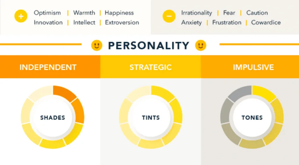
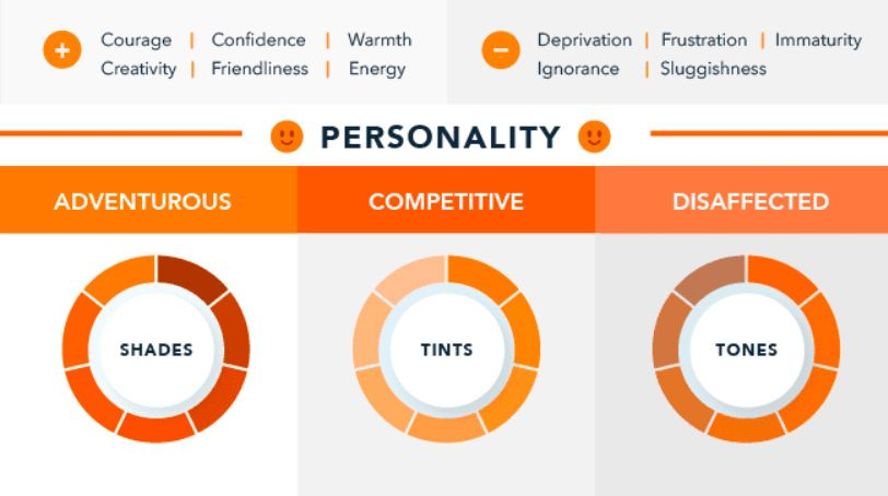
The impact of color psychology brands on purchasing intent is profound, as colors shape how a brand’s personality is perceived. Each color influences how customers interpret the brand’s “personality,” affecting their connection and engagement. While some colors broadly align with specific traits (e.g., brown with ruggedness), academic studies emphasize that the paramount consideration is aligning colors with the desired brand personality rather than adhering to stereotypical associations. The right color becomes a vessel for expressing and showcasing your brand’s distinctive personality, creating a visual identity that resonates authentically with your target audience. In the dynamic interplay of color psychology for brands, strategic color choices go beyond aesthetics, becoming a powerful tool to communicate and reinforce the unique personality traits that set your brand apart in the competitive landscape.
The right color appeals to your audience
Choosing the right color in branding is a dynamic interaction influenced by color psychology brands, and cultural perceptions play a key role in shaping color preferences. Individual preferences are shaped by environmental and cultural factors, often linked to gender associations. Men tend to prefer bright colors, while women tend to prefer softer shades. However, moving away from these stereotypes is a useful step for brands. Perceived appropriateness doesn’t have to be rigid, allowing brands to go beyond consumer tastes and expectations. Successful brands often thrive by challenging norms, proving that color choices can truly resonate with different audiences. By navigating the landscape of color psychology for brands, the right color becomes a powerful tool that attracts a wide audience and creates a unique brand identity that challenges stereotypes and conquers the market.
The right color differentiates your brand
The power of color psychology brands is critical to brand distinction. The brain prefers immediately recognizable brands, making color a fundamental element of corporate identity. Choosing color becomes a strategic weapon for new brands to stand out from existing competitors. The isolation effect, a psychological principle, emphasizes the importance of making a brand “stand out like a sore thumb” for better memorability. Optimal color coordination involves a visual structure with similar primary colors contrasting with accentuating secondary or tertiary colors. This principle also applies to marketing, where a well-chosen accent color like red can significantly increase conversions through visual contrast. The definition of success in these tests goes beyond simple measurements, emphasizing the subtle influence of color psychology on brands in creating a distinct identity that resonates authentically and leaves a lasting imprint on consumers.
The right color has the right name
The importance of color in branding goes beyond visual perception; color names play a crucial role in color psychology brands. Various studies have shown that Descriptive names significantly contribute to consumer preferences. Fancy names such as “mocha” and “brown” evoke different perceptions, with the former being more likable. This name effect applies to a variety of products, from cosmetics to paints. Unique and unusual names, such as “razzmatazz,” have a special appeal, influencing the choice of products, from jelly beans to sweatshirts. When creating a brand identity, choosing the right name for colors becomes a strategic step that improves the overall perception and brand recognition in the complex web of color psychology for brands.
How can you find out which colors work best for your own brand?
STEP 1: Understand the psychological impact of different brand colors
Color psychology is the foundation of how color psychology brands influence perception and behavior. Uncover the story behind each brand color that shapes the mood and perception of customers.
- Grab attention with red: Red encourages impulse purchases, as seen in Coca-Cola’s bold red color that entices consumers.
- Make an impression with pink: Barbie’s bright pink color evokes youth and bold energy, connecting with her target audience of young girls.
- Attract customers with orange: Nickelodeon’s signature orange color inspires adventure and creativity, which aligns with the brand’s childlike and vibrant image.
- Shine bright with yellow: McDonald’s strategic use of yellow arches conveys optimism and playfulness, increasing appetite.
- Use a calming mix of blue and green: Google’s soothing blue and green palette helps build users’ trust and comfort.
- Discover the comfort of brown: WWOOF’s earthy brown color aligns with its mission of organic sustainability.
- Make a lasting impression with Imperial Purple: The royal purple hue of Cadbury chocolate symbolizes high-end, gourmet chocolate.
- Use the striking contrast of black and white: Apple’s minimalist white and black colors exude sophistication and elegance.
- Demonstrate the versatility of multicolored colors: Instagram’s multicolored palette symbolizes creativity and diversity.
STEP 2: Understand the basics of brand color terminology
Familiarize yourself with key color terminology to communicate effectively with your design team. These terms include color hues, tones, shades, saturation, HSL, CMYK, PMS, RGB, and HEX color codes.
STEP 3: Research your competitors’ corporate colors
Analyze your competitors’ corporate colors to identify differentiators and increase brand awareness. Consider the impact of colors on visual identity, brand reputation, and content structure, and talk to brand managers.
STEP 4: Represent your business with the perfect brand colors
Brainstorm color ideas based on your brand identity, core values, and competitor analysis. Use a color wheel or palette generator to inspire and define your brand colors.
STEP 5: Consistently use brand colors in your design to connect with your audience
Determine where your brand colors should appear, such as on logos, websites, social media, and events. Create mood boards for each type of content, test colors in different formats, and organize designs into accessible folders.
Final Thoughts
Understanding the deep connection between colors and human behavior is not just a trend but a fundamental element in creating a compelling brand presence. With up to 90% of first impressions driven by color and color, increasing brand awareness by 80%, the strategic use of color is paramount. From evoking emotions through warm and cool tones to influencing conversions through carefully chosen color schemes, the dynamic interaction of colors is a language that brands must master.
By integrating cutting-edge strategies and a deep understanding of consumer behavior, Ficus Technologies helps companies navigate the complex landscape of color psychology, ensuring that their brand colors resonate authentically and leave a lasting impact on their target audience.
Certainly, changing a brand’s color can have a profound impact on consumer perception. Colors evoke certain emotions and associations, influencing how consumers feel about a brand. A strategic change in the color palette can redefine a brand’s personality, create a fresh narrative, and resonate with a new audience. For example, a shift from bold, energizing colors to soothing tones can convey a shift toward sophistication or reliability. This transformation not only changes the visual identity but also forms subconscious connections with consumers, affecting their trust and loyalty to the brand. Successful rebranding stories often attribute their success to a well-executed color change, emphasizing the undeniable impact of color on consumer perception.
While there is no one-size-fits-all answer, certain colors tend to have broad appeal across cultures. Blue, often associated with trust and calmness, is widely valued. Green symbolizes nature and is valued for its calming properties. Neutral colors, such as white and black, convey simplicity and elegance, which appeals to different audiences. However, cultural and contextual factors play a significant role. Brands should consider target audience preferences and regional color associations. Understanding the universal and culturally specific aspects of color psychology allows brands to make informed choices that resonate globally while respecting local nuances, ensuring a harmonious and appealing visual identity.


Color psychology plays a crucial role in shaping consumer perceptions and behavior. This article offers insightful guidance on choosing the right colors for branding, considering the target audience and emotional responses. It emphasizes the importance of consistency and readability in design. A must-read for anyone in the field of branding and design.